Google UX Design Professional Certificate Portfolio Project
Project Timeline
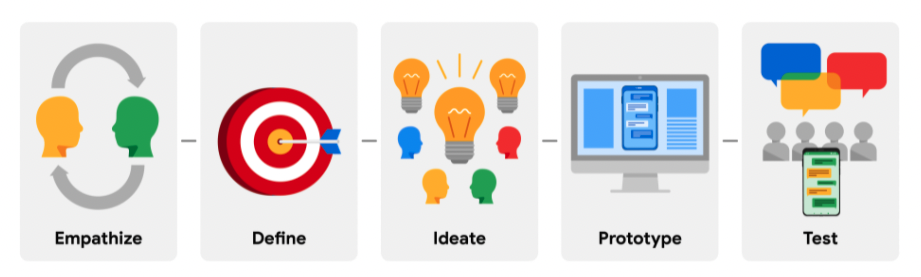
I followed the design thinking process that was taught in the professional certificate program to carry out my project.
The Problem
There is currently no free / no need-to-pay good all-in-one inventory tracker smartphone application that exists for small to medium-sized businesses.
Solution
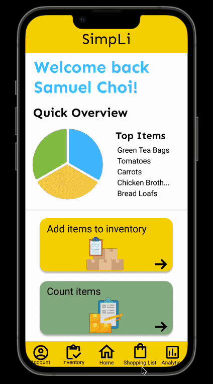
The restaurant inventory app “SimpLi” will let users easily manage inventory and can automatically create shopping lists, which will affect small to medium-sized business owners/managers by saving their time by not having to manually do inventory by pen and paper and ultimately improving their organization.
understanding the user
User Research
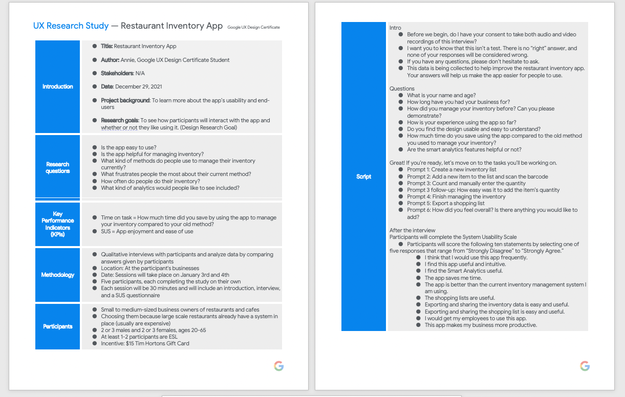
Before I conducted my research, I assumed that many restaurant owners and workers did not have a system to track their inventory, but they each had something similar; they all did by pen and paper, which took a lot of time and effort. I conducted interviews using a script I wrote with a few local small to medium-sized business owners and employees. I also conducted secondary research, such as competitive audits.
Main Findings
After conducting my interviews, I discovered 3 main and common pain points.
- Manually Checking: Users had to manually check when they were running low on items; thus, unexpected item shortages can often occur.
- Creating Lists: Users had to manually create lists of items that they needed to purchase or items that were running low in quantity
- Lack of Consistency: Users did not have a clear system in place with other employees about how to manage the inventory

Personas
Based on my research, I created 2 user personas who are the target audiences in order for me to be able to easily empathize with the users.


User Journey Map

Story Boards
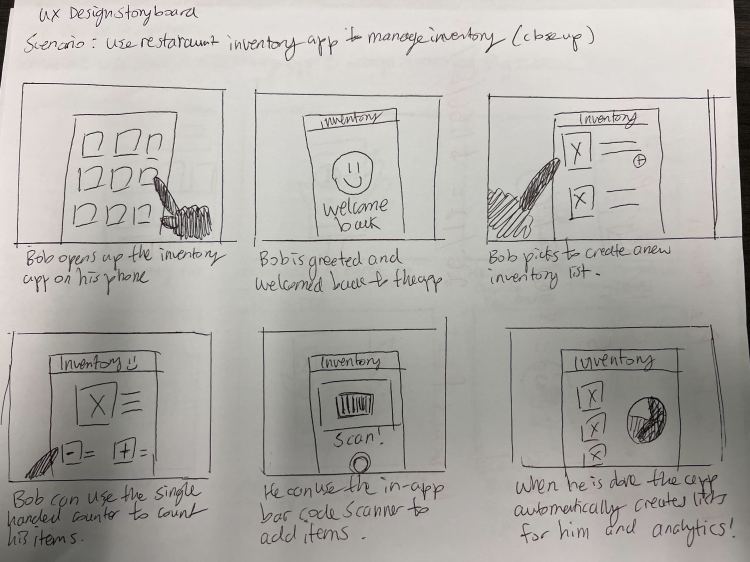
I sketched out a “Big Picture” and a “Close-up” storyboard to try and visualize how the users would potentially interact with the app.

Starting The Design
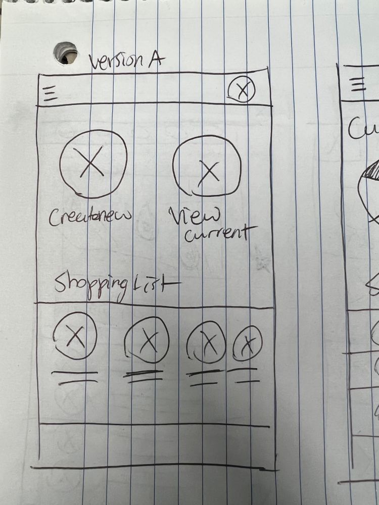
Wire Framing
I sketched down my ideas and created a bunch of messy lo-fi wireframes to get all my ideas down on paper. I eventually moved over to Figma to clean up my designs and create digital wireframes.


Low-fidelity Prototype
After I was done making my digital lo-fi wireframes, I created a low-fidelity prototype in Figma to use to conduct my first round of usability studies.

Usability Studies
I conducted 2 moderated usability studies with 5 participants each time.
Round 1 findings
- Users want to be able to count items faster
- Users wish for an easier-to-view format
- Users want more language options
Round 2 findings
- Users want to see their progress in adding items
- Users want to be able to categorize their items
- The top bar is a waste of space
Refining The Design
Ideating
I had to iterate upon my designs after conducting my usability studies. I started to create my hi-fi mockups alongside this step.

Mock-ups


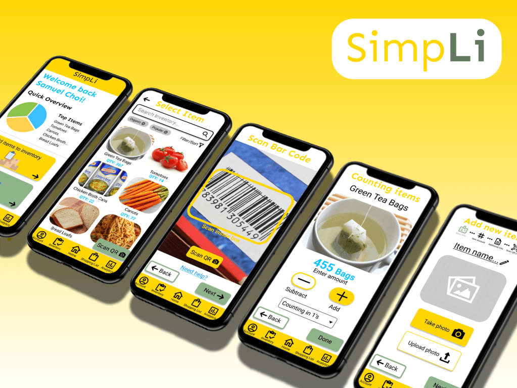
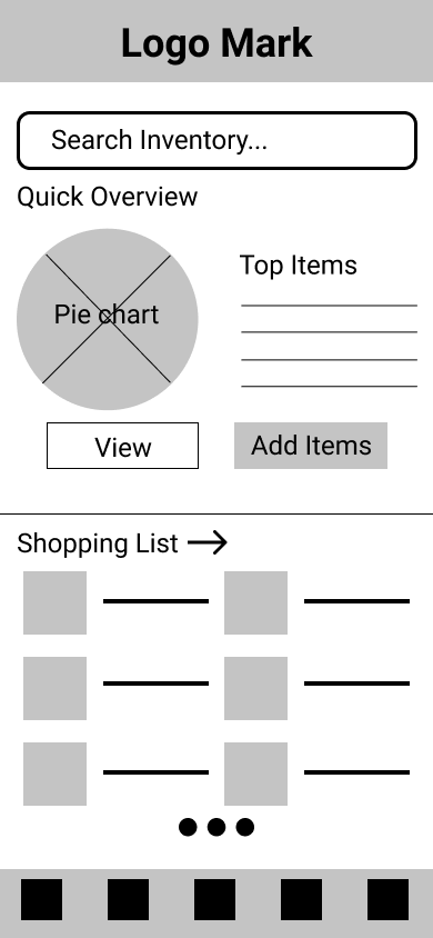
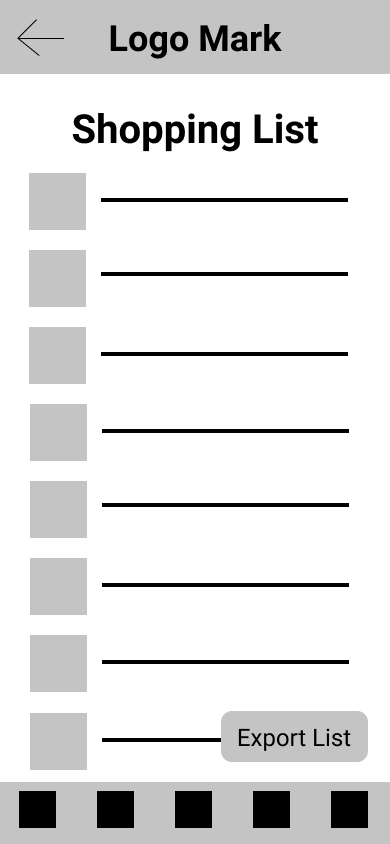
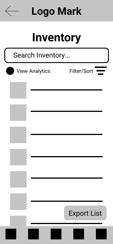
High-fidelity Prototype
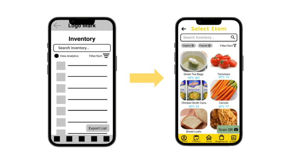
I created 2 different flows for SimpLi. The first one is “Adding a new item” to the app’s inventory. The second flow is “Counting items” for currently existing items in the inventory.

Accessibility Considerations
- I used high-contrast colours and large fonts to make it easier for users to see the app
- I tried to use a lot of iconographies as they are universally understood, and it would be easier for the “Next Billion Users” to understand and navigate the app
- I opted for a cleaner design of the app compared to the first iterations, so users can easily find information
“Accessibility allows users of all abilities to understand, use and enjoy the web.”
Avinash Kaur, Accessibility guidelines for UX Designers
Visual Design

Going Forwards
Impact
The Restaurant Inventory app “SimpLi” provides users with an all-in-one free-to-use smartphone application to keep track of their inventory. This ultimately saves users a lot of time and money.

What I Learned
As this was my first time designing an app and properly learning about user experience design, I learned many valuable tools from the Google UX Design Professional Certificate program.
I learned how to: empathize with users and understand their pain points; define users’ needs; brainstorm multiple different ideas and solutions to user problems; create paper and digital wireframes; conduct UX research fundamentals, and build lo-fi and hi-fi prototypes.
Doing this project, I additionally learned that there are multiple iterations of an idea and that the first iteration may not look the same as the final version. There will always be room for improvement.
Next Steps
1
Flesh out the rest of the app’s functionalities. SimpLi’s other main function is “Smart Analytics” which will predict when an item will run low on stock.
2
Conduct another round of usability studies with 5 different participants and summarize those findings and turn them into valuable insights.
3
Iterate upon the current high-fidelity prototype with new insights. Rinse and repeat until the app is polished enough for release.
