Move For Dolphins
Google UX Design Professional Certificate Portfolio Project
JUMP AHEAD TO
Project Overview
Duration:
February 2022 – March 2022 (6 weeks)
Tools:
Adobe XD, Adobe Illustrator, Adobe Photoshop, Pen and Paper
Roles:
UX Designer and UX Researcher
Design Prompt
My third and final portfolio project for the Google UX Design Professional Certificate was to design a mobile app and an accompanying website for social good. From the online design, challenge generator Sharpen I got the prompt of…
“Design a way to conserve an endangered species of dolphin”
The Solution
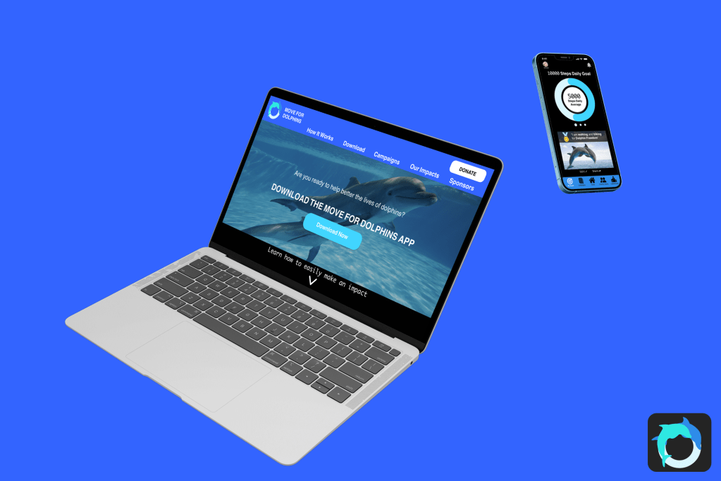
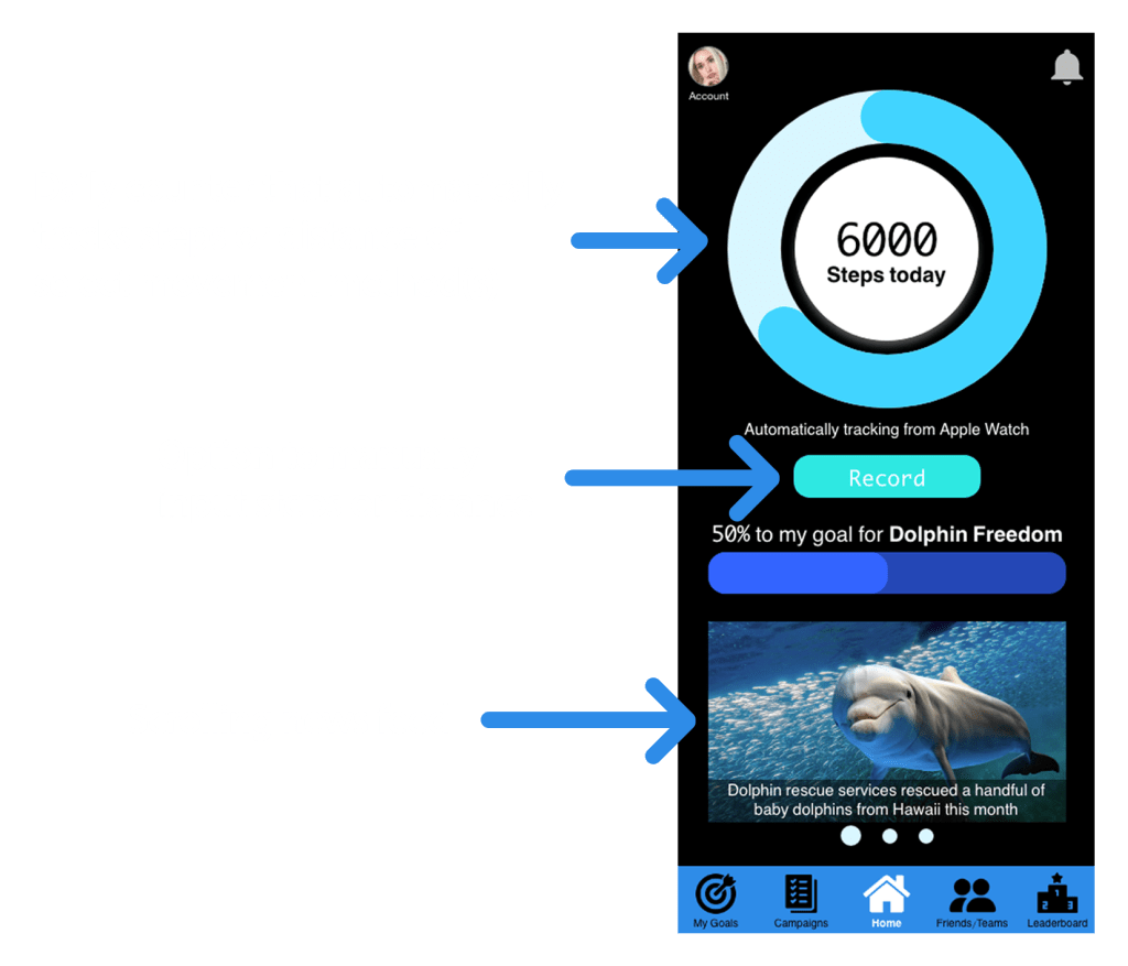
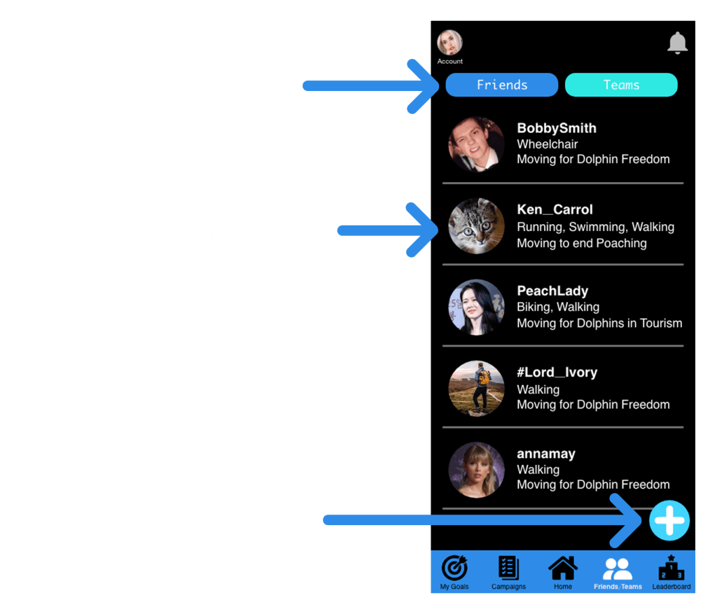
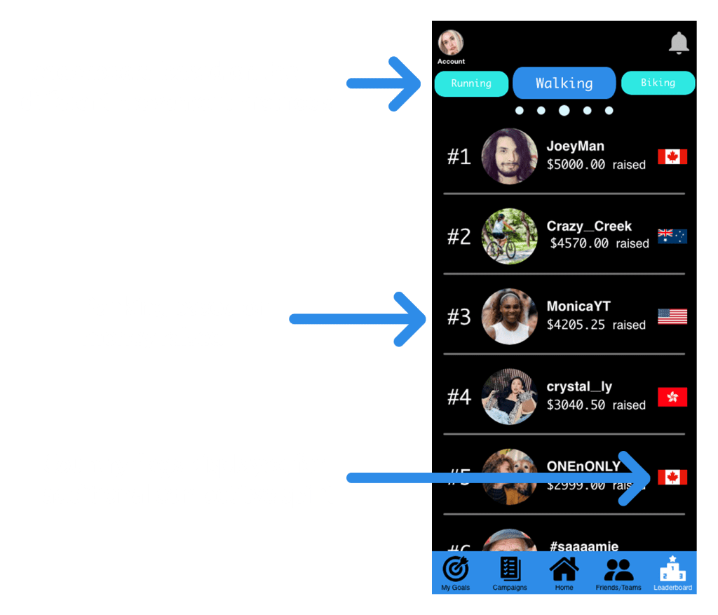
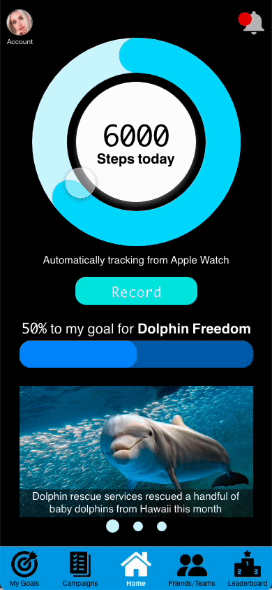
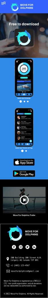
Although the prompt says to conserve a single species of dolphin, I thought I might as well help all the dolphins while I am at it, why limit myself to only one species. Move for Dolphins is a non-profit charity mobile app that incorporates walking, running, biking, swimming, and wheelchair rolling to help raise funds for dolphins.
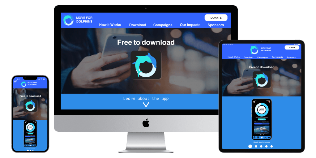
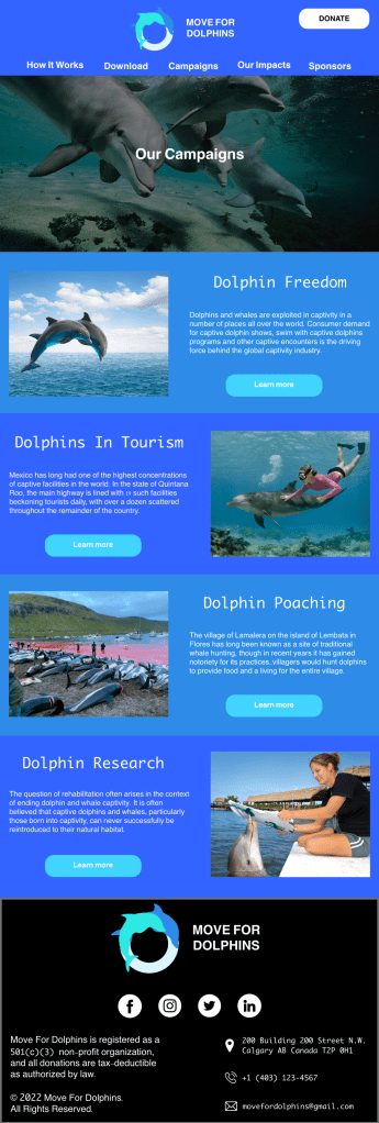
The responsive accompanying website provides information about the charity, dolphin conservation methods and the mobile app.


Understanding the user
Research
I conducted a competitive audit and researched why dolphins are endangered species, the specific reasons why, and ways people can help them. At first, I did not know that swimming with dolphins could be harmful to them.
My 2 direct competitors were, “Whale and Dolphin Conservation” a charity based in the UK, “Dolphin Project” another dolphin charity in the USA. My 2 in-direct competitors were “Charity Miles” an app with a similar premise and a local annual Calgary non-profit charity fundraiser event “Walk for Wing Kei”.


Personas

Problem statement: Lizzy Garcia is a frequent traveller living on a tight budget who needs a non-monetary method to help dolphins because she cannot donate that much money to charities
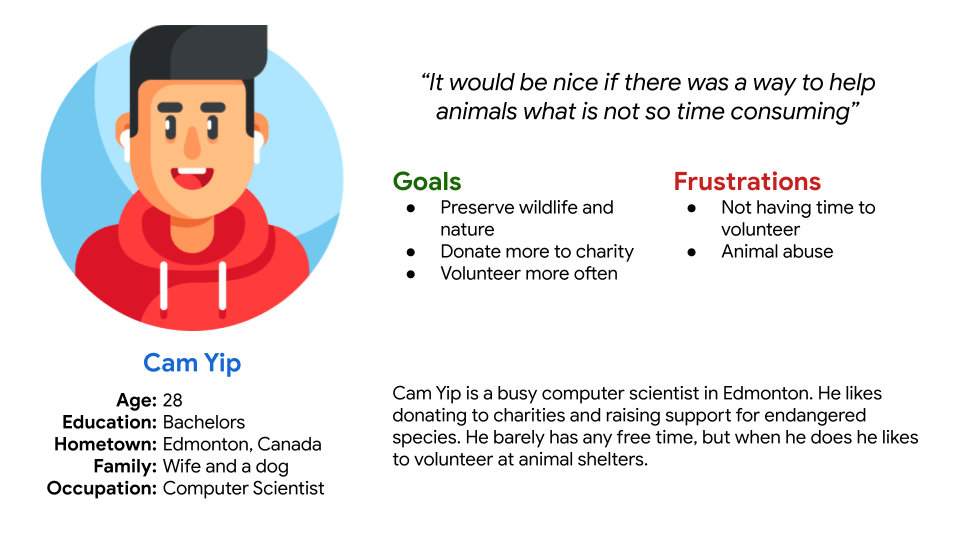
Problem statement: Cam Yip is a busy professional who needs a non-time-consuming way to donate and contribute to charities because he does not have time to volunteer in person but wants to help animals.
Starting the mobile app
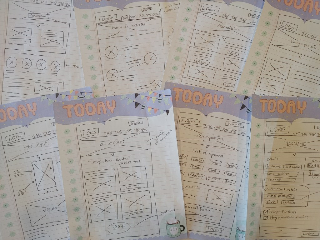
Brainstorming

I absolutely love how the only thing that is limited with the Crazy 8’s activity is time (and maybe ink and paper). Your imagination can run wild for 8 minutes.
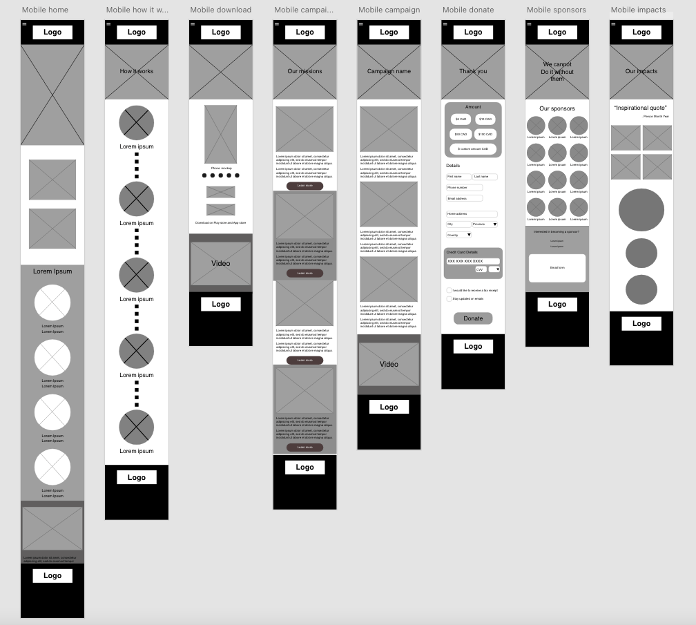
Wire Framing
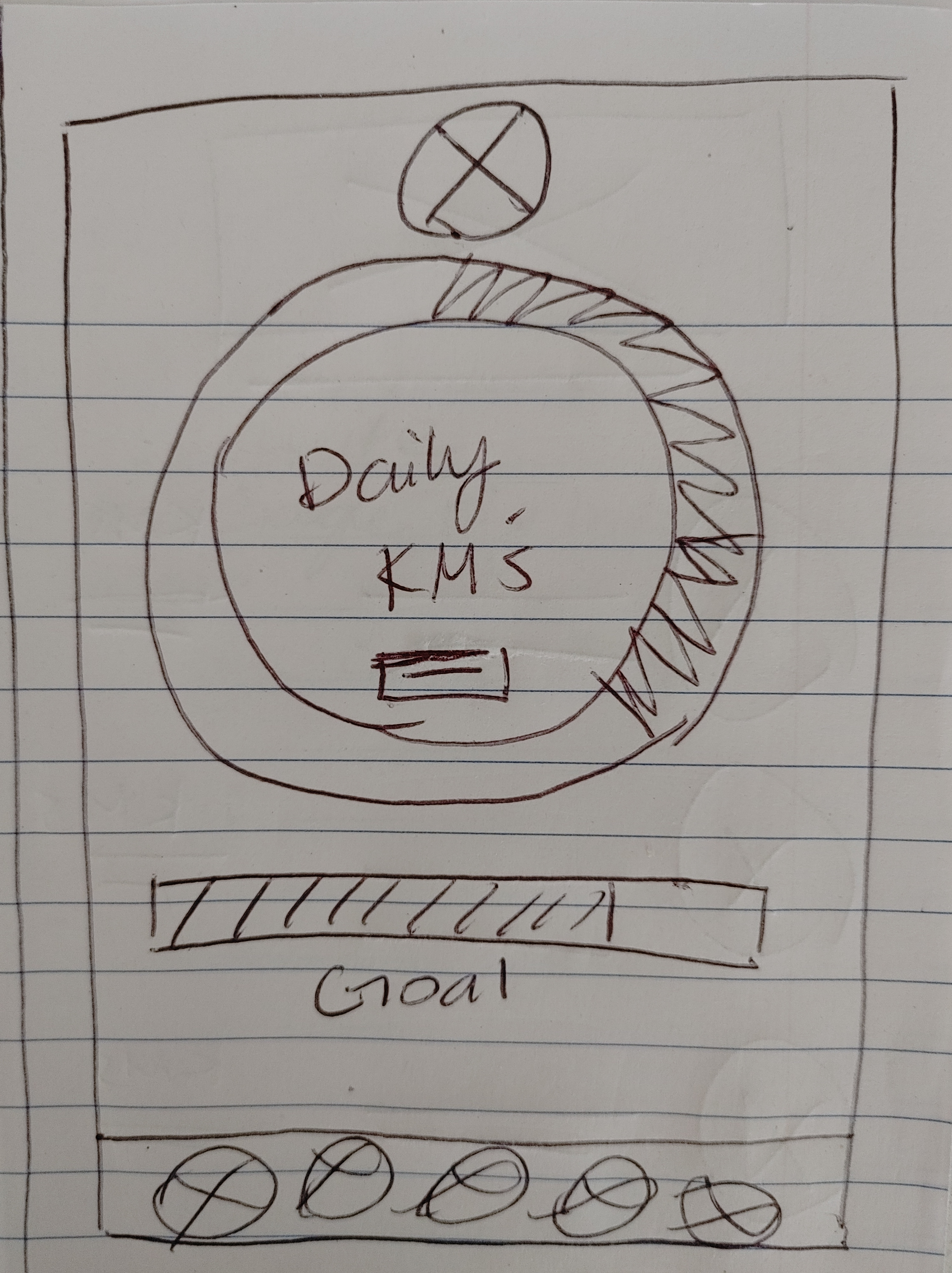
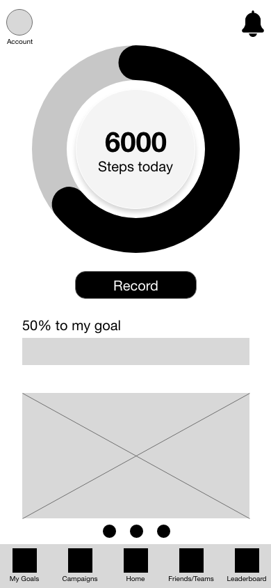

Low-Fidelity Prototype
Refining The Mobile app Design
Mock-ups


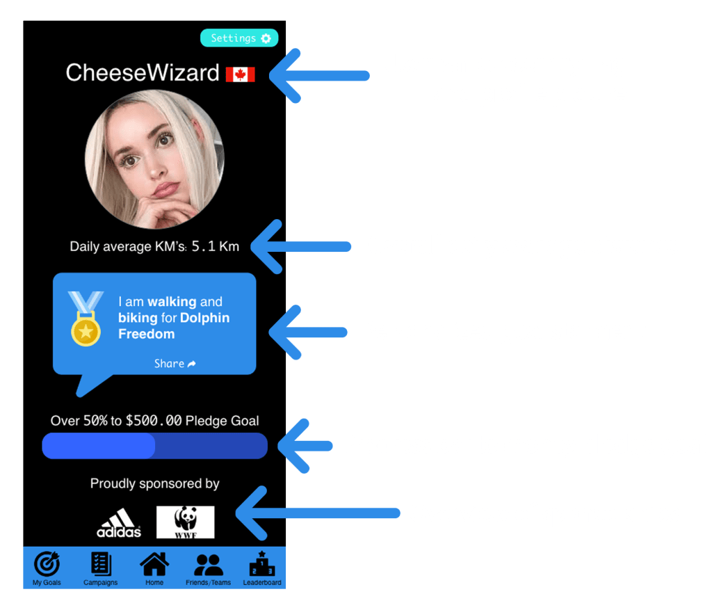
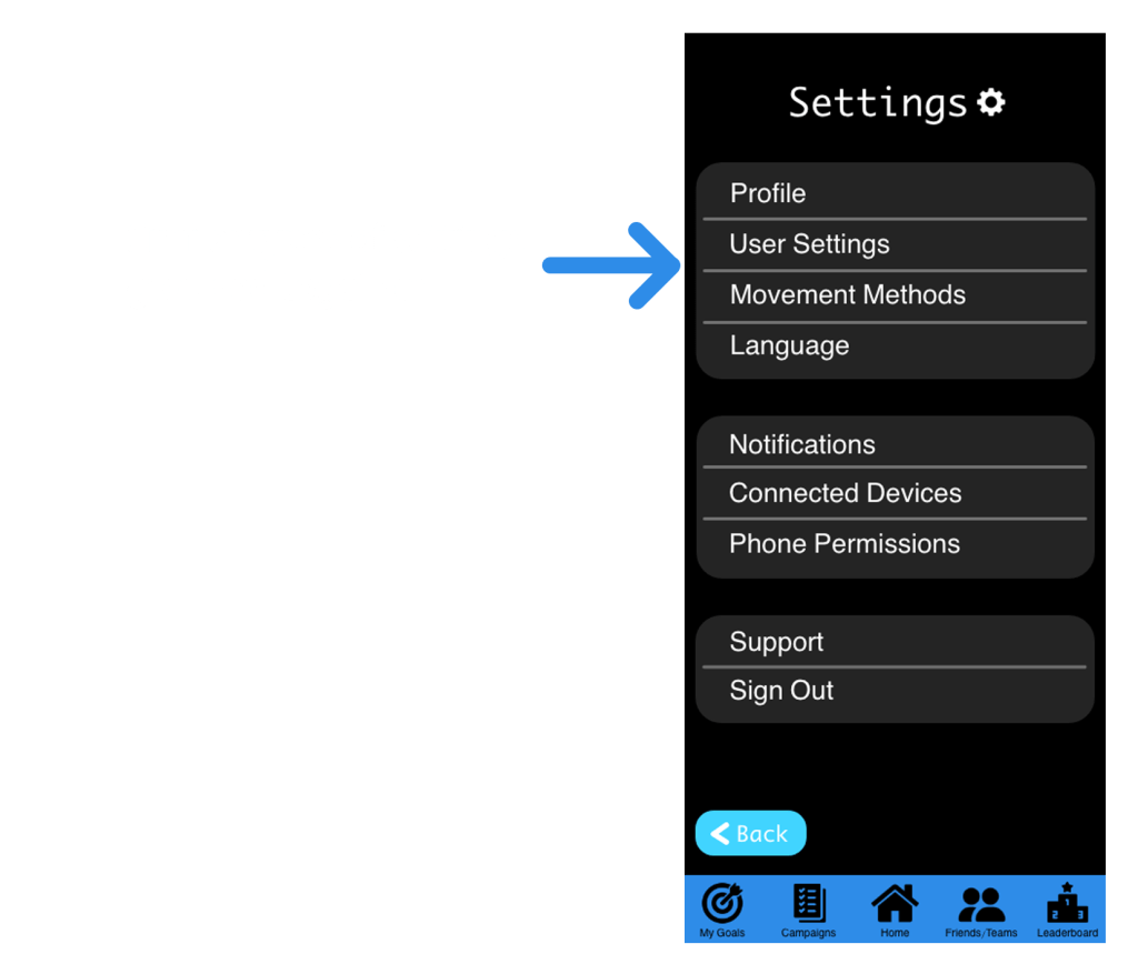
High-Fidelity Prototypes

Accessibility Considerations

Visual Design

Starting the responsive website
Use Case
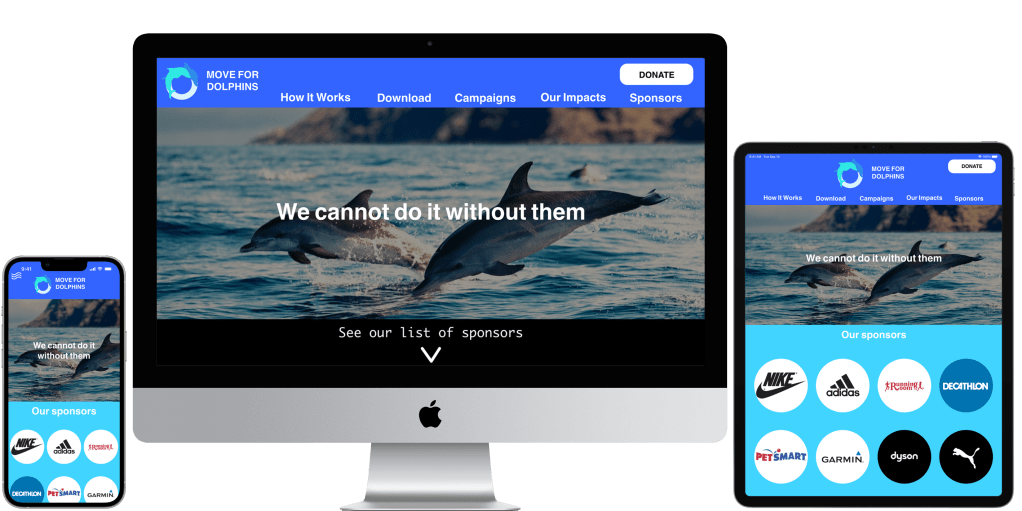
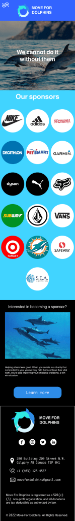
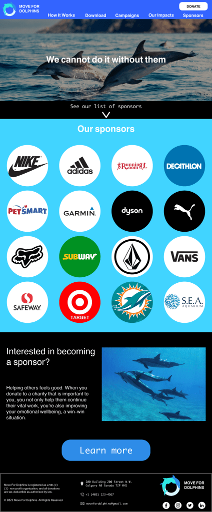
The responsive website will serve as complementary information to the mobile app and serve as the Move for Dolphins Charity website.
I first designed the website for mobile screens and used the Progressive Enhancement technique as more and more people are accessing webpages from mobile devices.

Sitemap

Wire Framing
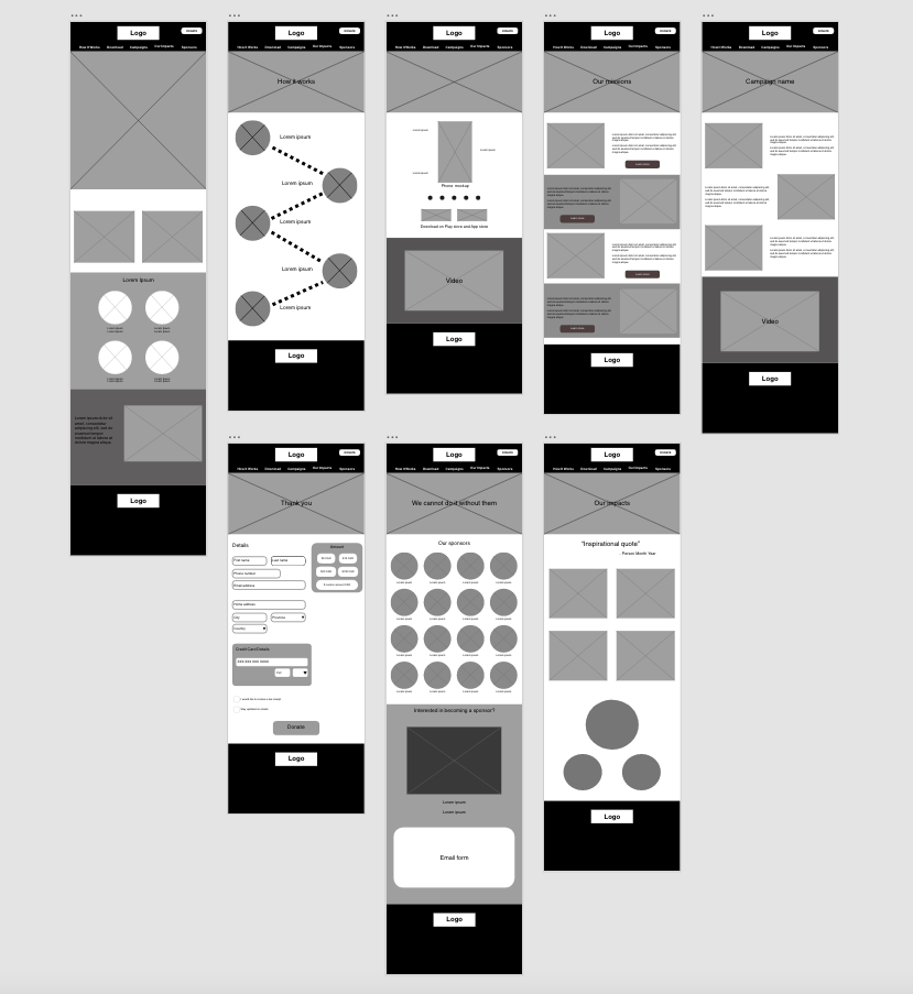

Low-Fidelity Prototypes
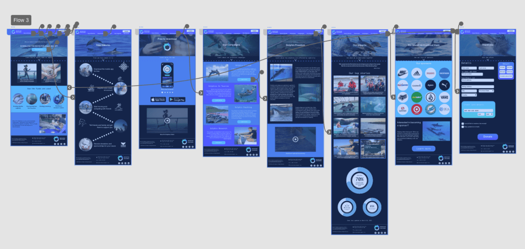
Refining the responsive website
Mock-ups


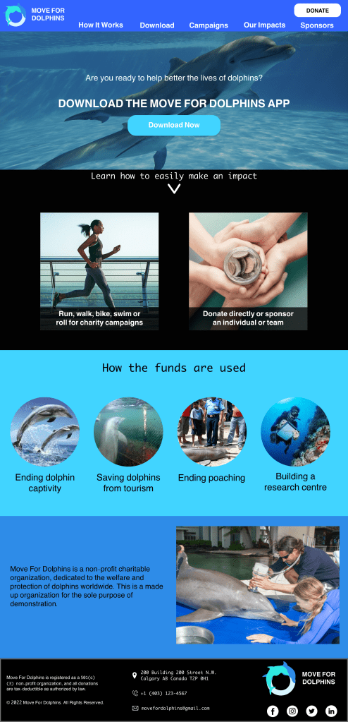


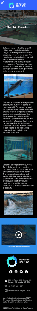
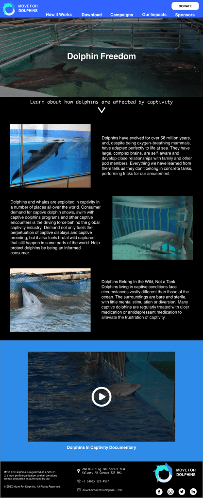
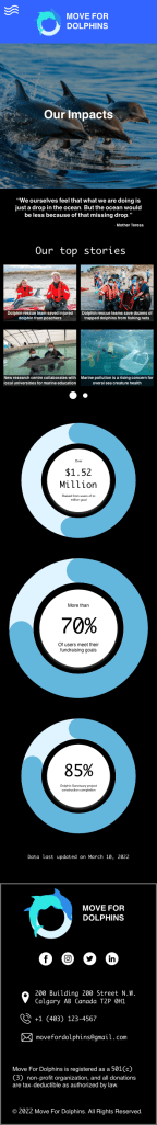
Please note that all of the campaigns’ information and other information used in this portfolio project about Dolphins is taken from actual charities Dolphin Project and Whale and Dolphin Conservation as I am not a Dolphin specialist.


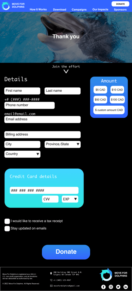
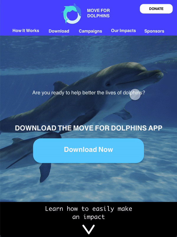
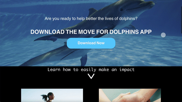
High-Fidelity Prototypes


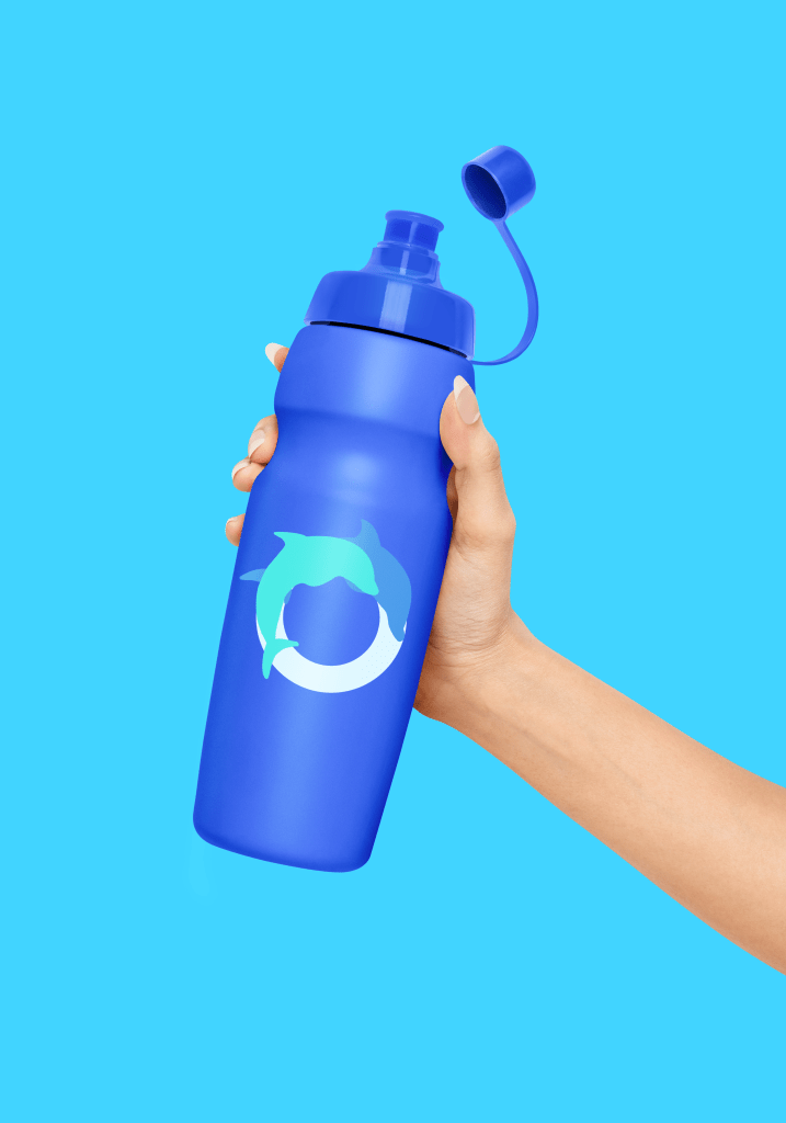
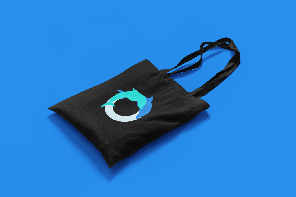
Print Media & merch


going forwards
Takeaways
I learned a lot from my last portfolio project for my professional certificate program. I learned how to create an app that would benefit the greater good (dolphins) and how to create an accompanying website. I learned about the 4 C’s not: cut, colour, clarity and carat; but: consistency, continuity, context, and complimentary. Read more about them here.
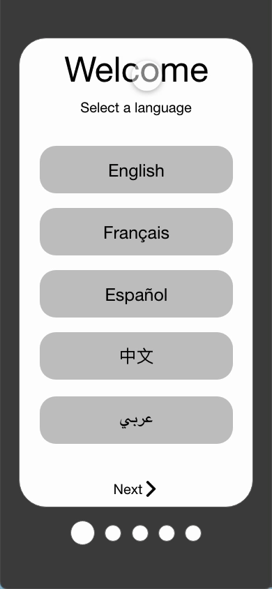
If I had the opportunity to go back in time to redo this project I would: ask wheelchair users how they feel about this concept and the app itself; make sure the primary colour of the mobile application and the accompanying website would be the same; conduct more usability studies on the app and website; and schedule more time to work on the website’s accessibility considerations i.e., language options and annotations for screen readers as I did not include them sadly.
Next Steps
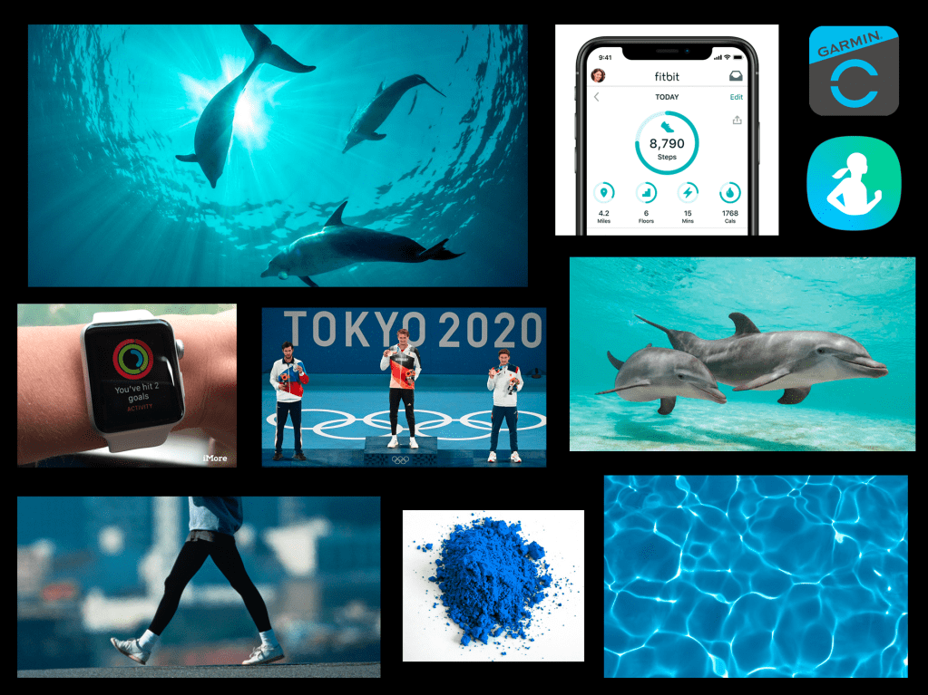
As you probably have noticed, I intended for the Move For Dolphins app is meant to be smartwatch compatible.
1
Figure out how the smartwatch compatibility and separate smartwatch app would work i.e., ideating and creating paper and digital wireframes.
2
Prototype and test the smartwatch app with smartwatch users. Discover common issues and themes from the research. Categorize further problems and prioritize P0 problems first.
3
Go back to the drawing board and implement research insights into the designs/prototypes.
4
Re-do steps 2 and 3 by completing another round of usability studies and implementing my findings into the designs.
 Annie Ngu's Portfolio