Google UX Design Professional Certificate Portfolio Project
The Problem
People are currently having a difficult time finding the ideal match for an animal to adopt and want more information about the animal’s profiles on current local animal shelter websites.
The Goal
My objective was to design a responsive website for a made-up local animal shelter. The website I created provides more in-depth (and fun) animal profiles and an animal matching service similar to dating apps for users to find their ideal pet.

UNDERSTANDING THE USER
Secondary Research
Before I conducted my primary research, I did some research myself on various animal shelter websites across the country. I did a competitive audit of the websites of Calgary’s largest animal shelters, the Calgary Humane Society and AARCS as they were my main competitors. I also did research into Petango, an animal adoption search engine and a Calgary-based dog store The Top Dog Store.
From my secondary research, I assumed users would want more information about the animals’ personalities and profiles than I did myself. I also discovered that many of these websites had a family-friendly tone and branding.
Primary Research
I interviewed 4 friends and family members who had previously adopted an animal from an animal shelter or who currently want to adopt a pet from an animal shelter. After all my interviews, I discovered 4 main user pain points.

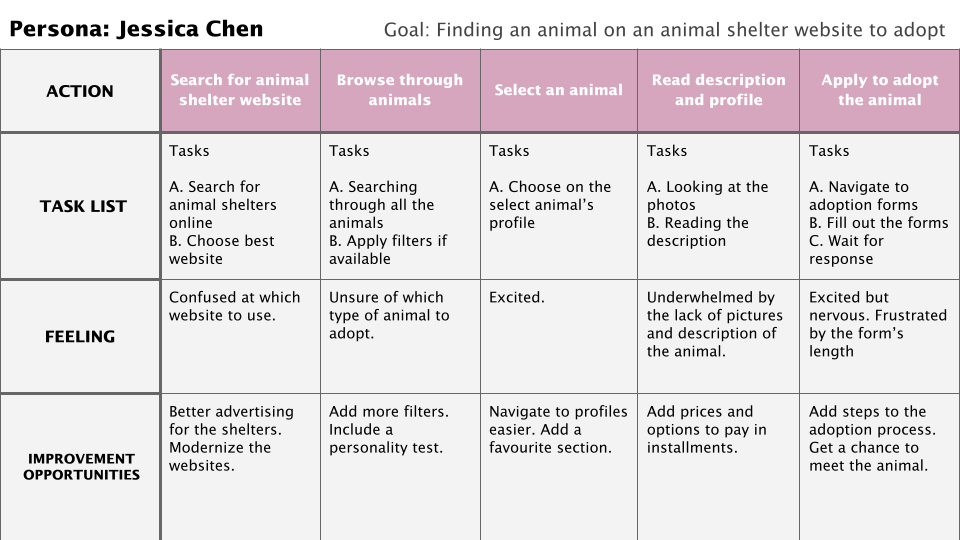
Personas

Problem Statement: Jessica Chen is a university student who needs an animal shelter website with search filters and descriptive bios because she wants to adopt the right animal companion.

Problem Statement: Will Tran is a busy father who wants to be able to adopt a dog for his kids for a reasonable price, because he cannot afford to pay the entire adoption fee upfront because of his tight budget.
User Journey Map
STARTING THE DESIGN
Brainstorming
After I understood the users, I began to brainstorm a few ideas and solutions to address their pain points and solutions to improve upon the flaws I discovered during my secondary research. I did some “how might we” exercises and “Crazy Eighths”, which were very useful as I was able to come up with many creative ideas.

Sitemap

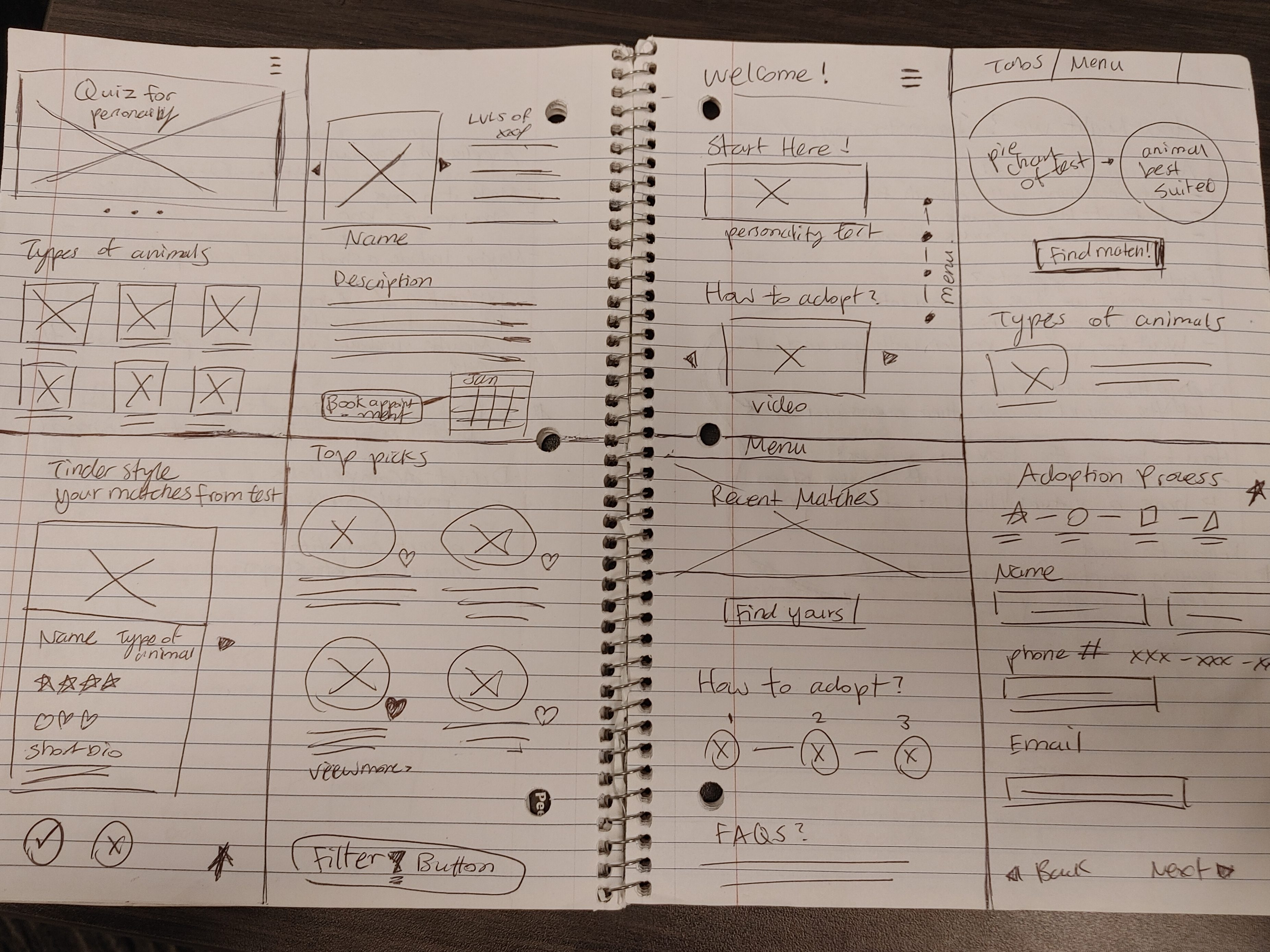
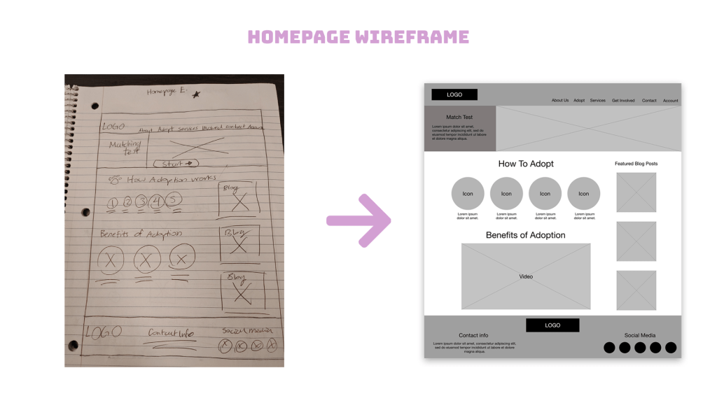
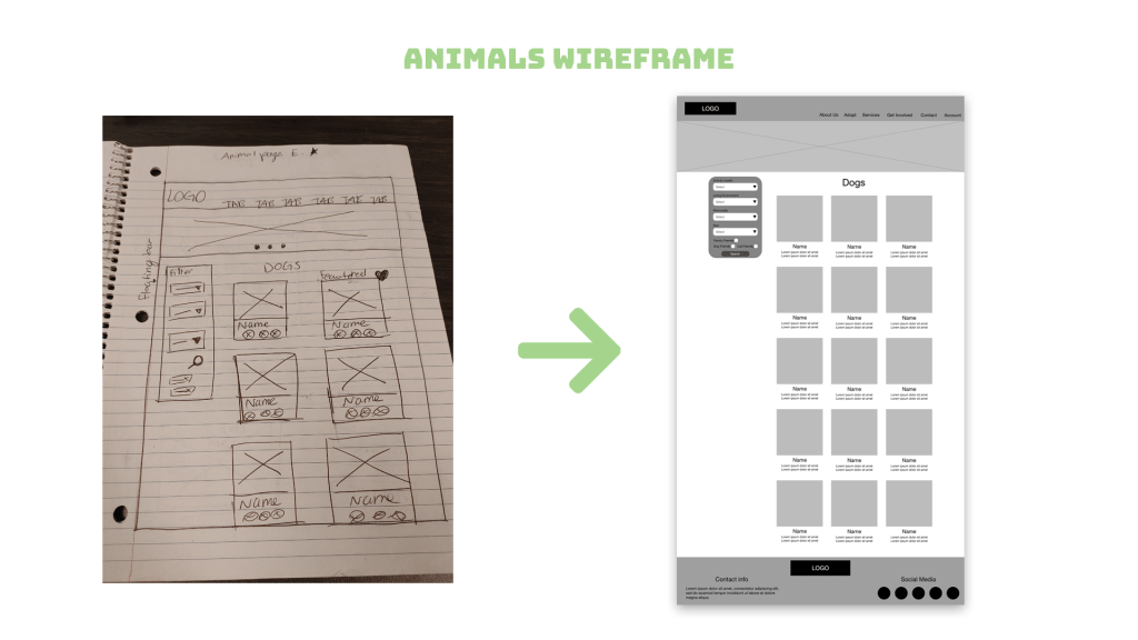
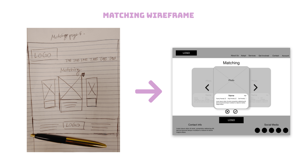
Paper Wireframes

Digital Wireframes


Low-Fidelity Prototypes
After I was finished transferring my wireframes from paper into Adobe XD, I wired them up to demonstrate the flow of looking for a dog to adopt and navigating to the “matching” feature.


Refining the Design
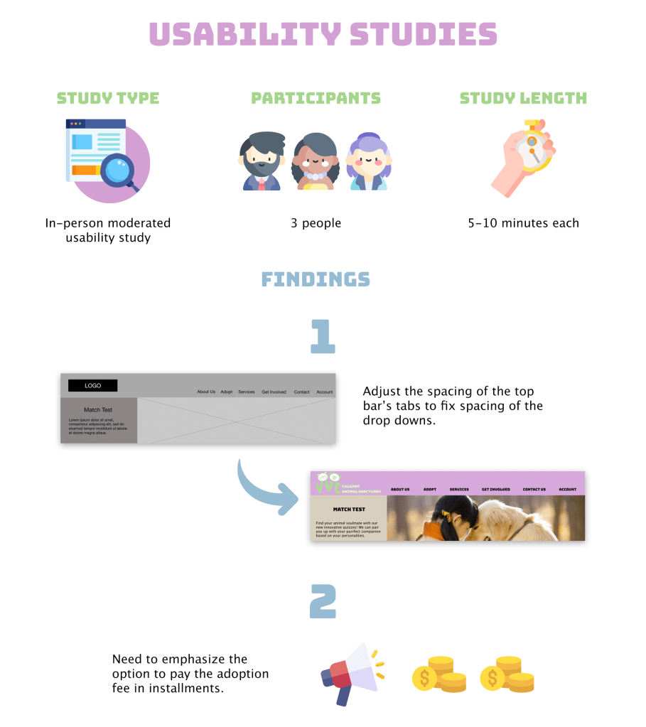
Usability Studies
I shared both my low-fidelity prototypes with 3 of the Interview participants to get their constructive feedback.
Mockups

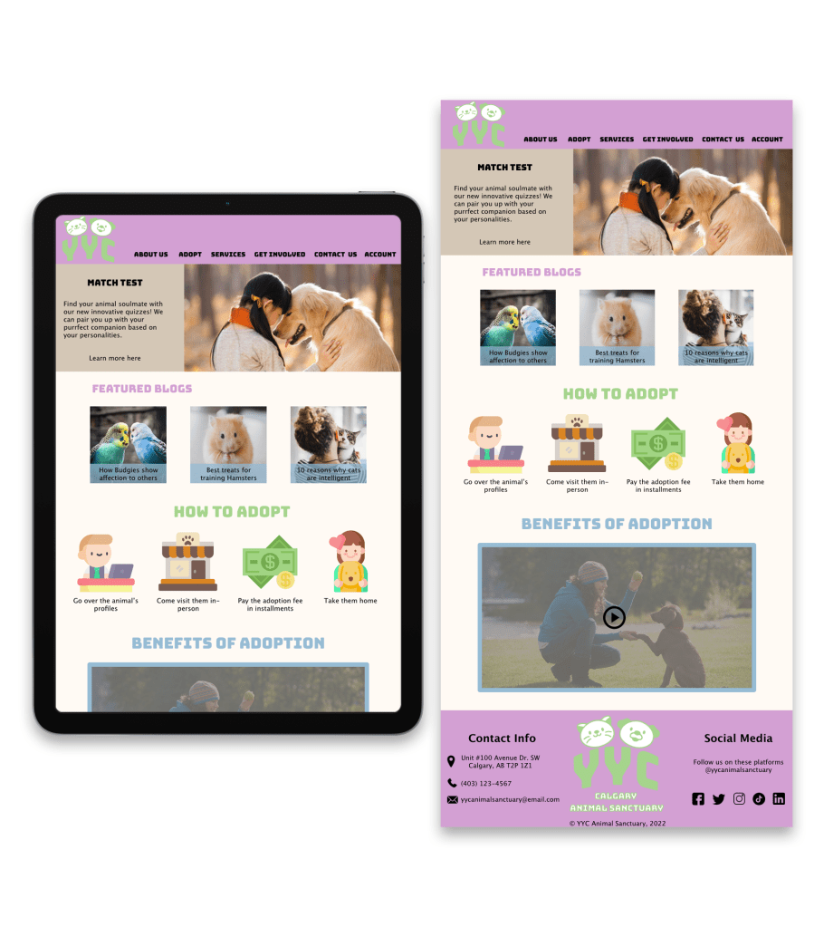
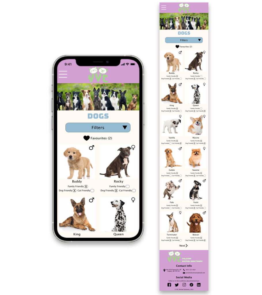
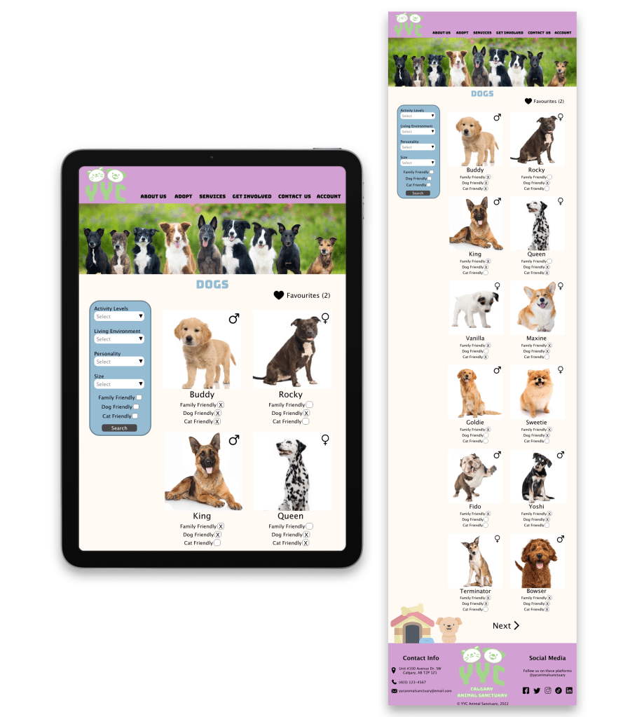
Mockups: Screen Size Variations
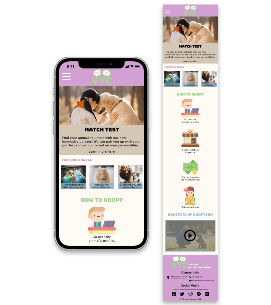
Mobile Version
Tablet Version
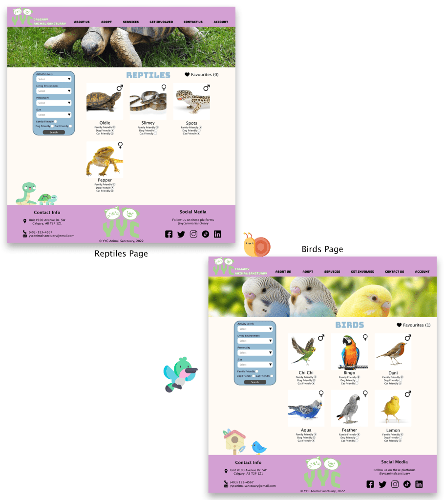
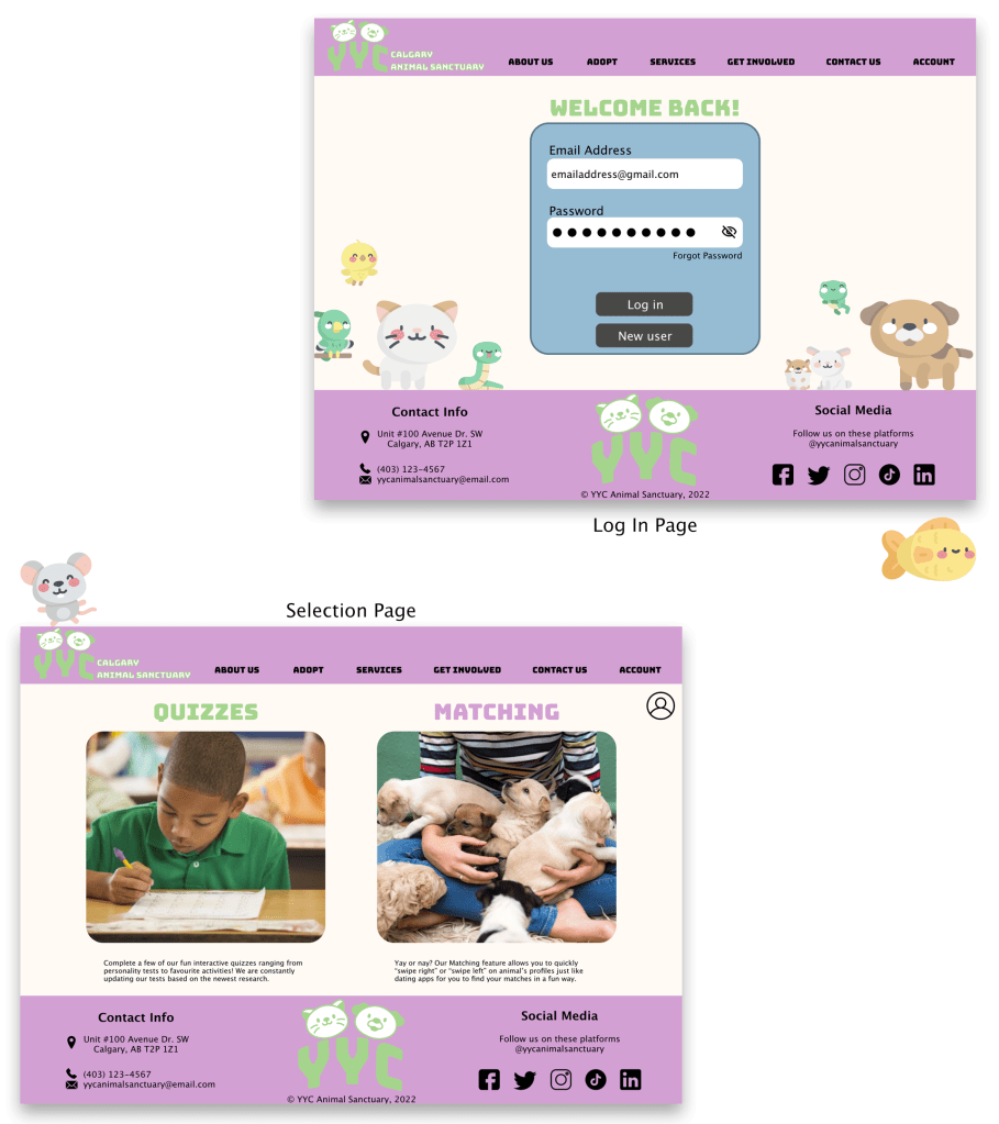
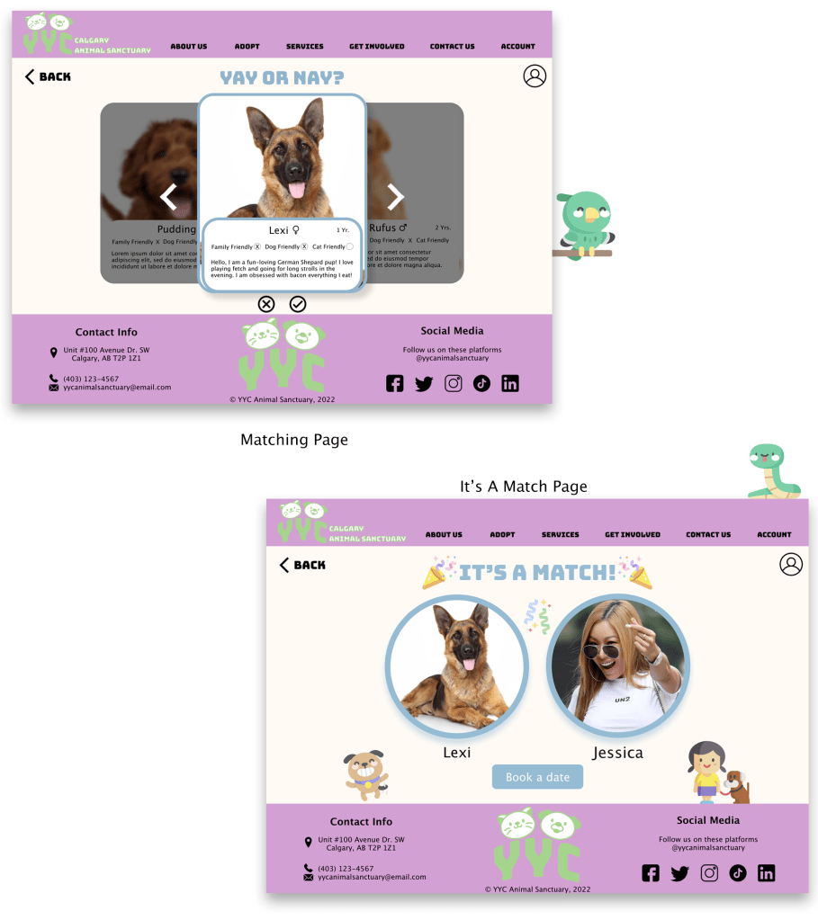
High-Fidelity Prototypes
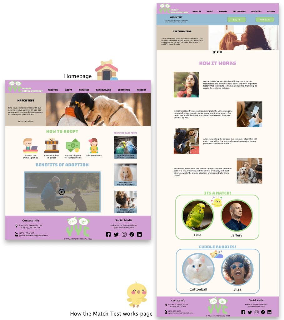
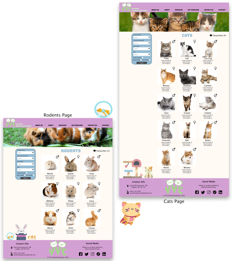
Below you will see 2 different flows of the website. The first flow demonstrates going through how the “Match Test” works and then logging in to complete one. The second flow exhibits someone navigating through the different animals available at the animal shelter and finally looking at a dog’s profile.


Accessibility Considerations
- I tried using as many universal icons throughout my designs for all people to easily understand
- I will add annotations for people who use screen readers to easily use the website
Visual Design

Going forwards
What I learned
Throughout this project, I learned how to use Adobe XD and create responsive web pages for different sizes of screens, including desktop, tablet, and mobile. I enjoyed the challenge of having to design layouts for each screen size version and accommodating the limited screen real estate on mobile screens.
Next time, I would like to include all of the tablet and mobile mock-ups and have a section for print media to help further solidify the branding.
Next Steps
If I had more time with this project, I would…
1
Create the adoption online process. I will create paper wireframes and then move on to digital wireframes.
2
Build the fees and policies page in order to further advertise the ability to pay the adoption fees in installments.
3
After creating the rest of the functionalities, I will conduct another round of usability studies, find insights and rinse and repeat until the website reflects the intended user experience I have in mind.
